Friday 11 March 2011

100 Years of GF Smith Paper.


Before starting task 2, I re-read the brief which said to create a poster that celebrates 100 years of GF Smith Paper. The poster must look professional, use the skills we learnt from the workshops with Richard Sweeny and include the type: 100 years of GF Smith Paper, Design Museum, 01-31 July 2011.'
I decided to look at different ways of encorporating the word 100 into the poster and did some research on it.  I came up with a few ideas like making the 100 out of shapes, using my sculpure from task 1 in the poster or creating the text out of paper like Rob Ryan and other artists who specialise in papercut.


As the brief said I would have to change my sculpture to use it for task 2 I decided not to use it, as that would mean altering it in some way and then putting it back together to hand in as task 1.. which would be time way too time consuming. I therefore thought of making extra shapes to use instead of taking them from my sculpture. I began to draw out ideas in my sketchbook and decided that i would make the new shapes out of coloured paper as the poster would look too bland if it was all white.


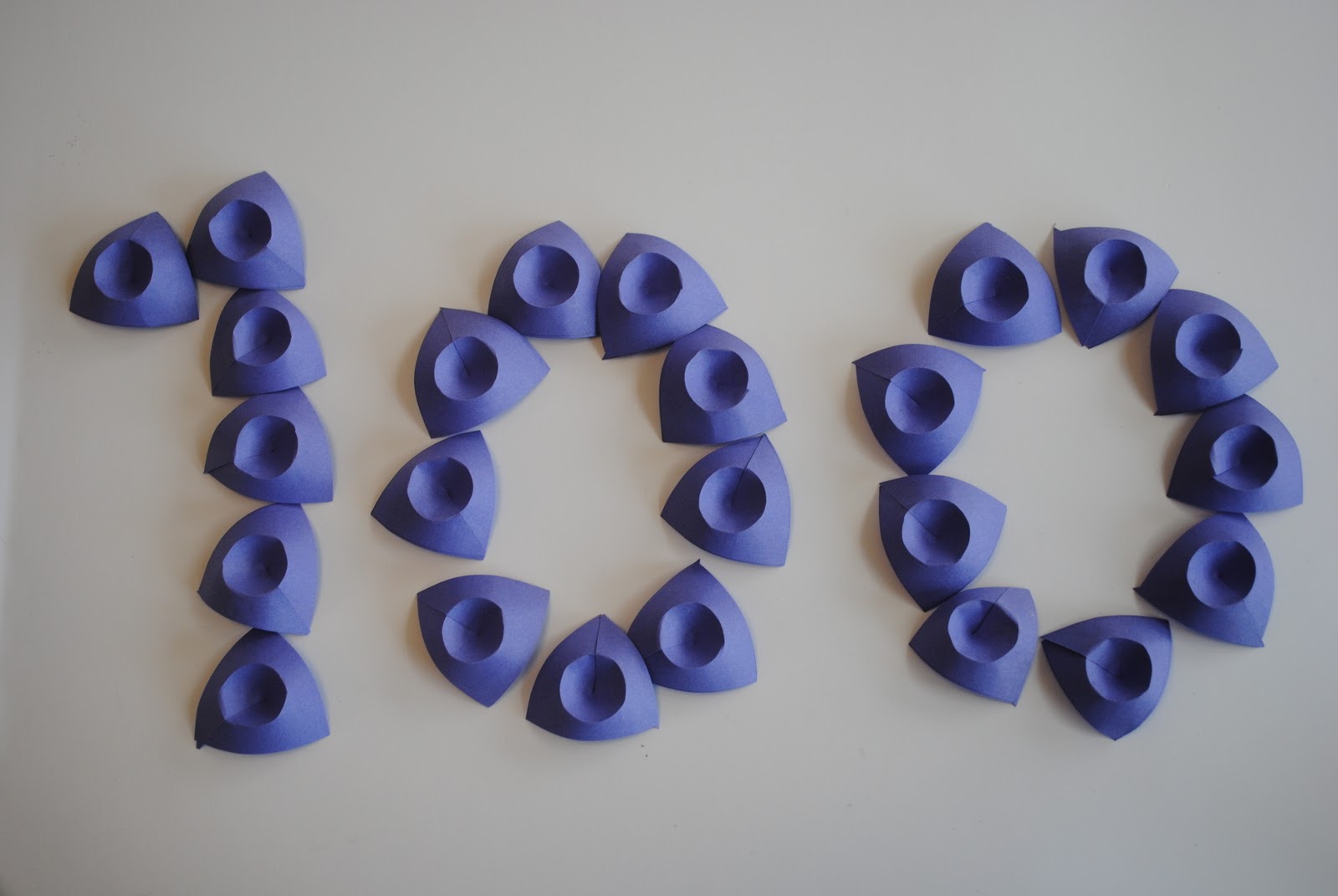
I made just enough shapes out of purple paper to use to construct the number 100. After much deliberation in my sketchbook and plenty of layouts i decided that i would use the above photo on my poster and add in the text later on in photoshop.


I cut and cropped the photo into photoshop and the erased as much of the shadow as possible so it looked like I had just places the shapes straight onto the poster. The magic wand tool helped alot!

I then added the text making sure they were on different layers incase I did something wrong and lost all my work. The poster at this point was looking too blank and I felt I needed to add more colour to it.

I started out by placing a black block over the right hand side of the poster but decided it was too harsh and used the colour tool to select a colour off one of the shapes. I moved it around to experiment with different shades of purple and eventually came to a decision.


Next came text. There were so many to choose from but I settled on a simple and professional font that I thought worked best, 'Plantagenet Cherokee'. After finishing it all and making sure my text was in grid form and everything lined up I saved it as a PDF file and sent it off to print!


Wednesday 9 March 2011

One Hundred

Before starting the poster I thought it would be best to look at what 100 means. What is stands for and look at things that are also celebrating 100 years of something.


The above posters are celebrating 100 years of a company. They are just two examples of a way in which i could go about making my poster for GF Smith Paper. 


The number 100 stands for a century. 100 years is a long time and people who make it their 100th birthday will no doubt make a big deal out of it!! Its quite an achievement, therefore the I should try and reflect that in my poster design.

Monday 7 March 2011

Numbered Typography

As I'm making a poster for 100 years of the company I thought about making the number 100 out of paper instead of the text. Here are some ways I could do it.

To do something like this I would have to adapt it and papercut the number.That would mean drawing out my design and then carefully cutting the design out making sure it all links up together so it doesnt fall apart when lifted. Kind of like this work except for the numbers.

I also came across a technique I had previously found when searching for paper typography except this time they made out the number 5000. I love the colours in this peice, I think it really catches your eye and would work well on a poster.


Wednesday 2 March 2011

In the mean time...

While making all my paper shapes I started to think about task 2. This is to design and create a poster that celebrates 100 years of GF Smith Paper. 


When thinking of how to present the poster I came across some photos of paper typography. I was quite impressed with the results and decided to have a go myself.


Started out with srtips of A4 paper, scissors and pritt stick. I then ran my scissors along the stipd of paper to make them curl up.

 Here is a very quick experimentation of this method. I think if I spent more time on it and paid more attention to detail it could turn into something quite good. I like how the loops on the last 0 overlap eachother.


Tuesday 1 March 2011

The making of 100 shapes..

I started to make the shaes for my final sculpture. I had previously decided that I would make 100 shapes so that it links in with task 2. I measured each shape out, 10cm X 10cm, meaning each one is 100cmsquared. I then used a compas to draw a circle in the middle of each one. After cutting them all out I then had to find a way to score a perfect circle. I did it by using a drawing pin to hold down a strip of card and then putting my scalpel through the card where the edge of the circle was. By twisting the square round you score the circle perfectly :)


Each card then had to be put together. i cut a diagonal like from the middle of each card and then pritt sticked the edges together. A few hours later.. 100 shapes were made!


Before sewing my shapes together as I had origonally planned I tried out a few different ideas of how I could put them together.Started off by piling all 100 shapes ontop of eachother and created a sortof bridge out of them.

The way the edges of the shapes stuck out at different angles reminded me of the Opera House in Sydney, Australia. Even though I really liked how it turned out I decided not to use this as my final idea as the whole point was that you could see each individual shape and with this you cant really tell how many there are.

This shape made me think of roses and the way petals are layered up around the center of the flower.The photo below is where I decided to line them all up in a row to create a sort of snake like shape.